

Heyo! I’m Alistair and I’m an art director, problem solver, designer, write, and swiss army knife of a creative.

offagain intimates
A Study of Desire, Intimacy and Lingerie Production and Advertising as it Pertains to Queer Male, Genderfluid, Nonbinary and Transmasculine Bodies.

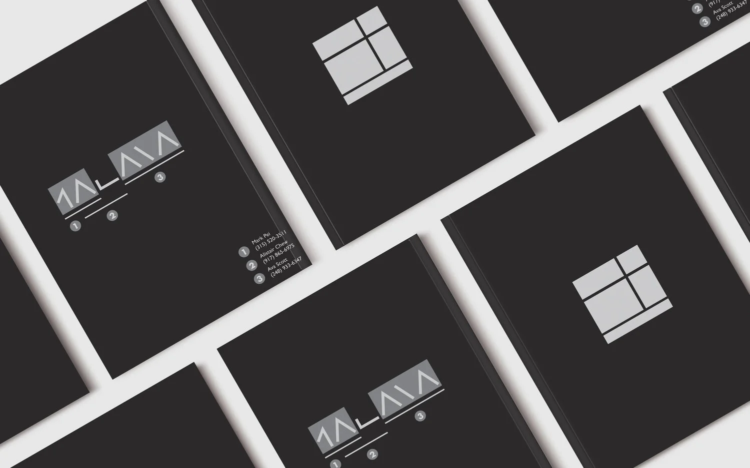
Prattonia 2020
Graphic Design, Book Design, Photography
Prattonia 2020 is the yearbook for the Pratt graduating class of 2020-- inclusive of graduate, undergraduate, and associate level students. Pratt has a long history of allowing a group of students to create the yearbook and print between 1,000 and 1,500 copies to be distributed. The budget for this Prattonia was $25,000 inclusive of all ancillary costs.


Cmd X, Cmd V (Cut, Paste)
Art Direction, Photography, Book Design
Cmd X, Cmd V is a photography book and exploration in fashion photography. The work is an experiment in translating what collage could look like in a digital space, and explores the boundaries of image manipulation. For me, the work was an exercise in styling, make-up, hair, photography, book layout, and art direction.
Centralized around image-making and the differences between human and machine manipulation of image, Cmd X, Cmd V, the keyboard shortcuts for “Cut, Paste”, reflects on the aesthetics of machine learning and what the human counterpoint is to that aesthetic.


MOCA Rebrand
Brand Identity, Brand Strategy
I took the opportunity to rebrand the Museum of Chinese in America because of its importance as a cultural institution, but also as an opportunity to also adjust its strategy. I believe that the MOCA needs to engage with a younger audience in order to continue the work it’s doing informing Americans about the history of culturally Chinese people in this country.
As for the identity, I based my design off of two things: the first is that of the connecting of Chinese American communities scattered across the United States, as evident by the MOCA’s exhibit Gathering, and the second was that of the calligraphic grid.


Nestlé Waters Rebrand
Brand Identity, Speculative Design
Water is the most important resource on our planet. As a part of my rebrand exercise, I followed two unique directions.
The first direction was to celebrate the individual water brands owned by Nestlé Waters North America by drawing focus to the logos and the spring locations of each water brand. The water would also be sold in cans, a material more sustainable than plastic, displaying a large wrap around graphic of each individual brand, drawing attention to the brands histories. Along with this effort, Nestlé Waters would also provide water fountains in civic spaces that distributes the water around each community the origin springs are in. The intention of this design effort was to pay homage to and celebrate the individual water brands and communities under the umbrella of Nestlé Waters.


Anal Sex Positions: Starter Pack
Photography, Graphic Design, Writing
The Anal Sex Positions Starter Pack is a deck of 20 cards. Each card has a description of a different anal sex position with instructions on how to perform it, and a depiction of the sex act on the reverse side.
Stylistically, the imagery is seventies porn-inspired. The images for the cards were created by photographing models, editing them into black and white, and then processing them with heavy grain to give them the desired retro effect. After the images were processed, they were printed out and then painted over with acrylic paint to serve as avatars for users of the product to project themselves onto.


Goldenrod
Graphic Design, Book Design, Writing
Goldenrod is a magazine and collection of works by Asian American artists. The project is a bound book of images of work that faces interviews and quotes by the artists speaking about their experiences as Asians and Asian Americans and how this experience has informed their art practice.
The name “Goldenrod” comes from the name of the original yellow Crayola crayon. The name comes from an experience I had in the third grade where a white teacher took the beige crayon from my hand as I was drawing a self portrait, and replaced it with the Goldenrod crayon and told me “this one suits your skin more”.


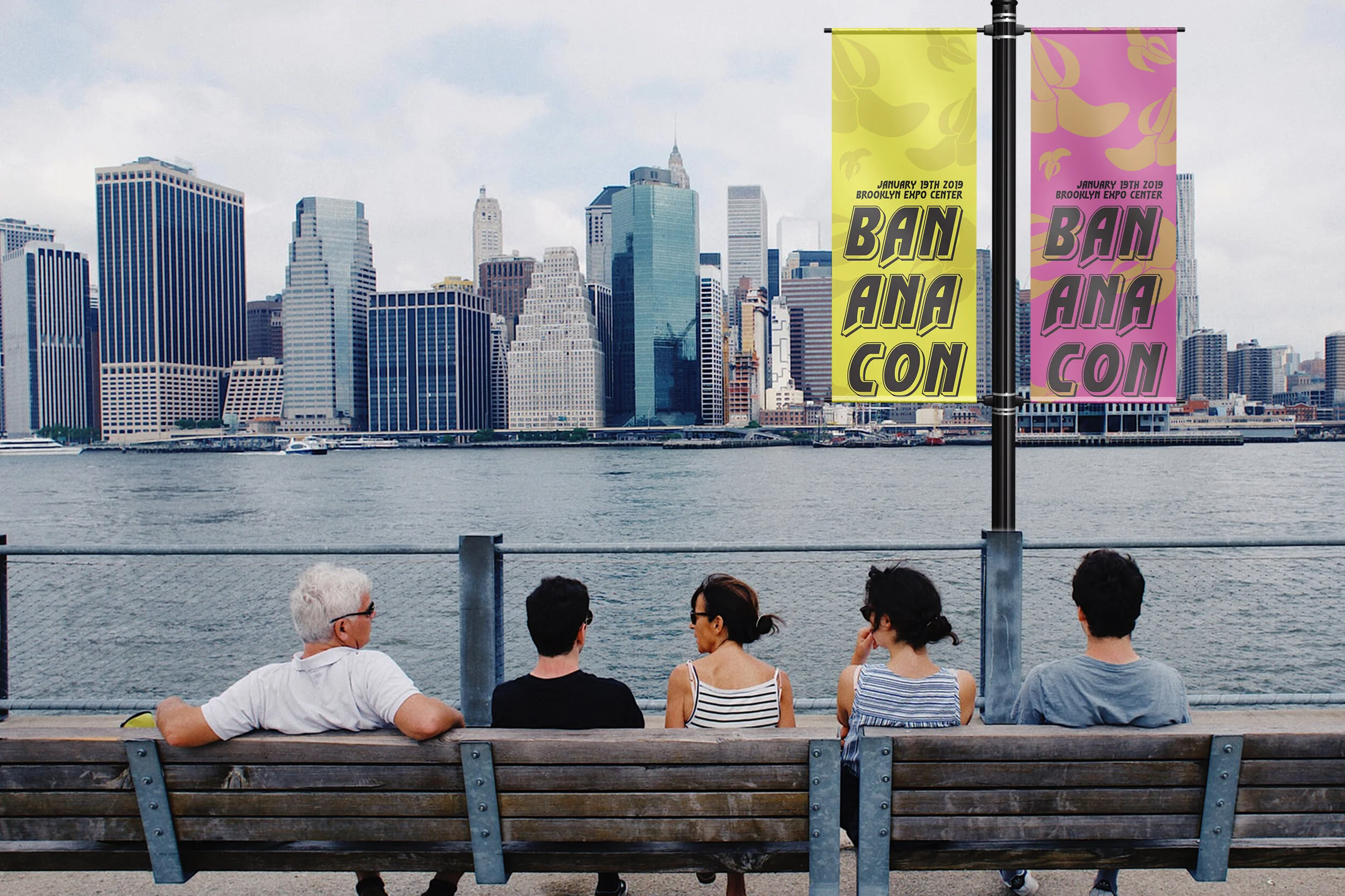
Bananacon
Branding, Event Planning
Bananacon is an event I proposed that would bring together both Asian Americans, and non-Asian Americans in New York City.
The event would provide an event where people could gather and enjoy panels led by Asian American community voices, and engage in a marketplace that would sell and advocate small Asian American businesses. Beyond the planning of the event, I have also created a website for the event with an interactive element that allowed users to find out more about proposed vendors, panels, and events that would be present.


Something About Intimacy
Interactive Design, Sound Design
Inspired by my interactions as a dog owner with other dog owners at the dog park, I created an interactive space that activated users of the Pratt Institute Library. With a projection and voice over of questions that gradually become more intimate in time, guests were asked to move from partner to partner between questions, and to stay within various rectangles. Less intimate questions take place in the largest rectangle with a short amount of time to answer, while the most intimate questions take place in the smallest rectangle with the longest time to respond. During the most intimate of conversations, participants are clustered closely together. During this phase of the interaction, participants become very aware of their personal space physically, as they are surrounded by intimate conversations they are both engaged and not engaged in.


Burberry Rebrand
Brand Identity, Brand Strategy, Photography
As a luxury fashion brand, I thought it was a shame for Burberry to follow suit in the “bland-ing” trend that has persisted in recent memory.
My branding for Burberry leaned into the company’s promise to hold an equal male-to-female board and staff ratio, and I based the typographic logo on Mrs. Eaves, a historic British font, rather than Bodoni, an Italian font, Burberry had previously used.
I chose to keep Burberry’s classic check as a textile for the main brand, although I did clean up the proportions and weights of the lines, working in ⅓ proportions. Then, drawing inspiration from the original brand mark of the knight’s horse, I created a secondary textile that resembled a snaffle bit and the straps attached to it to guide a horse. This textile would be exemplary of the Burberry Prorsum brand, while the two work together to create a third textile.


