


Prattonia 2020
Graphic Design, Book Design, Photography
Prattonia 2020 is about the disparate voices we embody and engage with during our time at Pratt. It is the graduating student, and the school at large. It is a deli worker who crafts sandwiches for heavy-eyed students in the middle of the night, and the kind “hello” from an acquaintance you can’t seem to remember the name of. It is the community of a dorm room, and the community of a borough. Prattonia 2020 is an attempt to encapsulate the experiences of the graduating class as it moves out, in, and out, again through the campus gates.
Prattonia is a student designed publication that celebrates the graduating students at Pratt Institute. Simply put, Prattonia is the Pratt Institute yearbook. Every year a team of 2-6 upperclassman students embarks to capture the memories, students, and spaces that make up Pratt through design and sometimes even the pursuit of unconventional styles. The Prattonia is revered for its diverse range of forms, styles, and themes as well as it’s century long history.
Over the course of this year, Prattonia has been a reason to meet 550 of our peers, a stressor that has taken hours of our lives, a reason form new connections and reinforce old ones, an archive that persisted despite the chaos of 2020 (as it’s designers were spread across the country), a social experiment, but most of all it has been a humble group project that started in a coffee shop in Brooklyn, and turned into a book that will travel the world to reach its intended audience.


A note on the covers
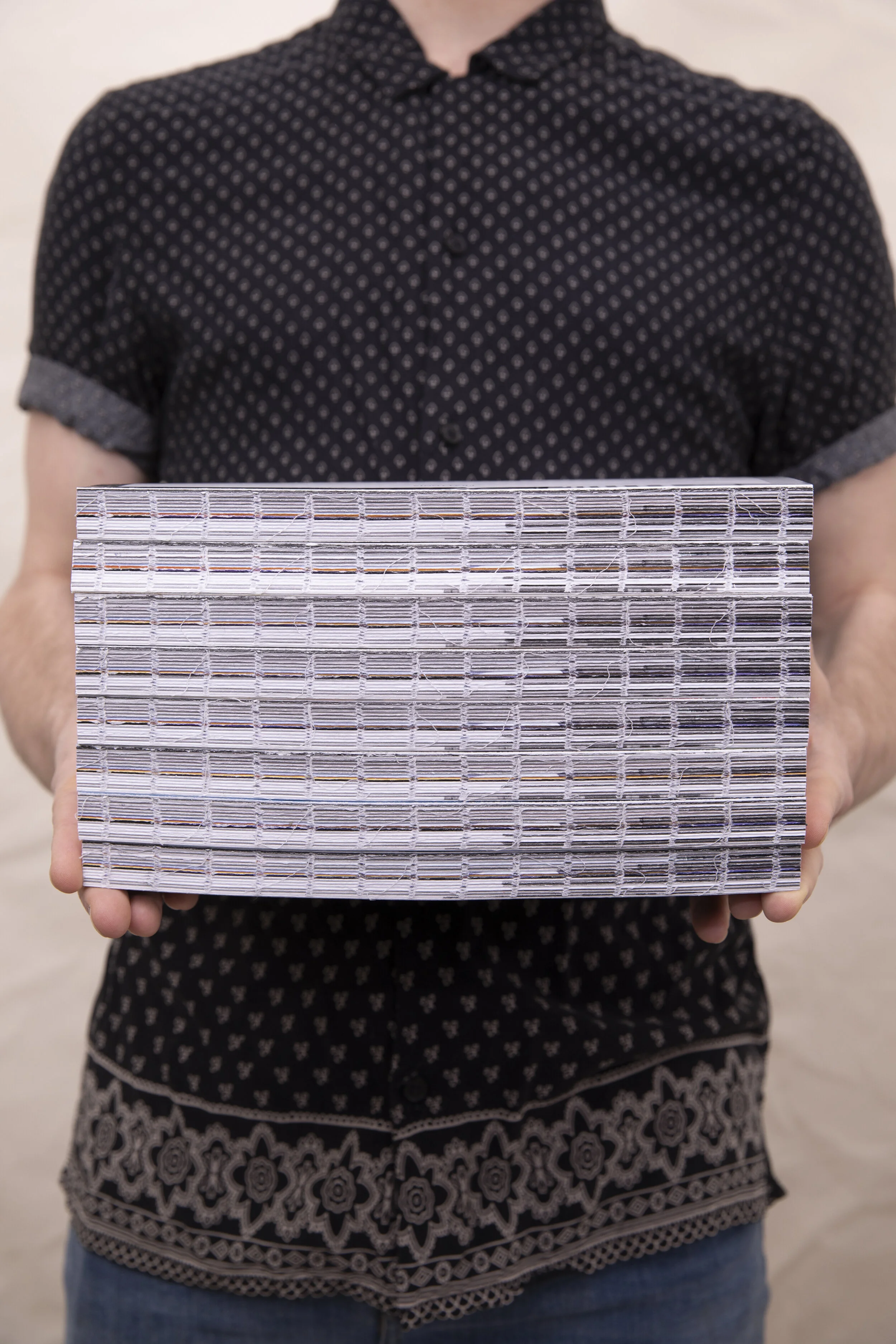
Prattonia 2020 manifests through eight different variations in the covers. The colors chosen for the eight covers transition from dark, cool colors to warm, bright colors. When all 8 books are present and ordered properly, they resemble the colors of the sky during a rising or setting sun. This dusk/dawn color palette is prevalent throughout the books in the form of interior color spreads representing the transition this book marks in the lives of its audience. From embarking on our educations at Pratt, to becoming graduates, and from the memories and transformations during our time here, to the continuing pursuit of our careers in our larger communities, this book’s purpose is to hold memories for sentimental reflection. It was our intention that the design of the covers represented this by allowing each student to be able to select a book that reflected themselves and their time at Pratt.
Unfortunately now, due to the COVID-19 pandemic, random covers will be sent out to students.


About the team. The Prattonia 2020 team (to themselves, Prat20ia) was and continues to be a group of four students, friends and designers whose distinct voices can be found throughout the book. One favors the repetition of words, often filling a page with these ‘graphic elements’. Another adores and uses the color pink to add warmth to a page, something the team agrees suits them. The third is known for their meticulous use of grids and is also partial to the organizational use of a spreadsheet. And the last uses gradients so gratuitously they cannot even see a page with flat color. Together as students they faced their graduating year with gusto and pizzazz. Together as friends they shared laughter, drinks and tall tales to unwind. And together as designers, they worked tirelessly to make a book for their community at large.